


Across Medable’s marketing ecosystem, I lead end-to-end design initiatives that translate complex ideas into clear, compelling brand experiences.
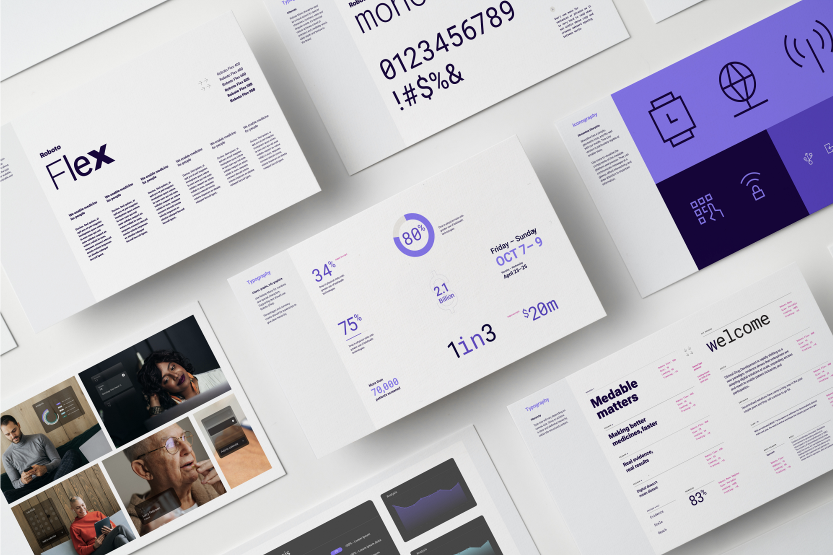
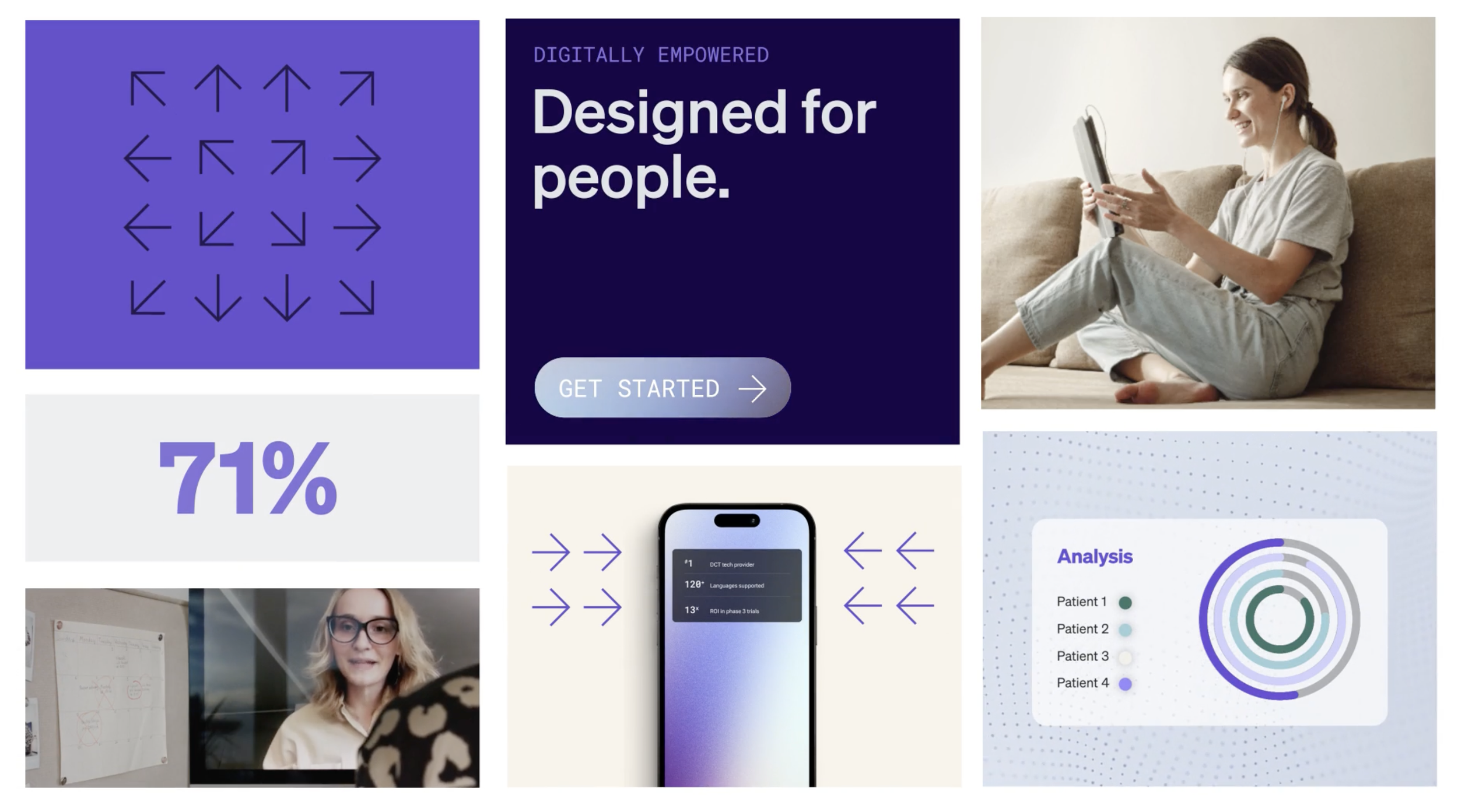
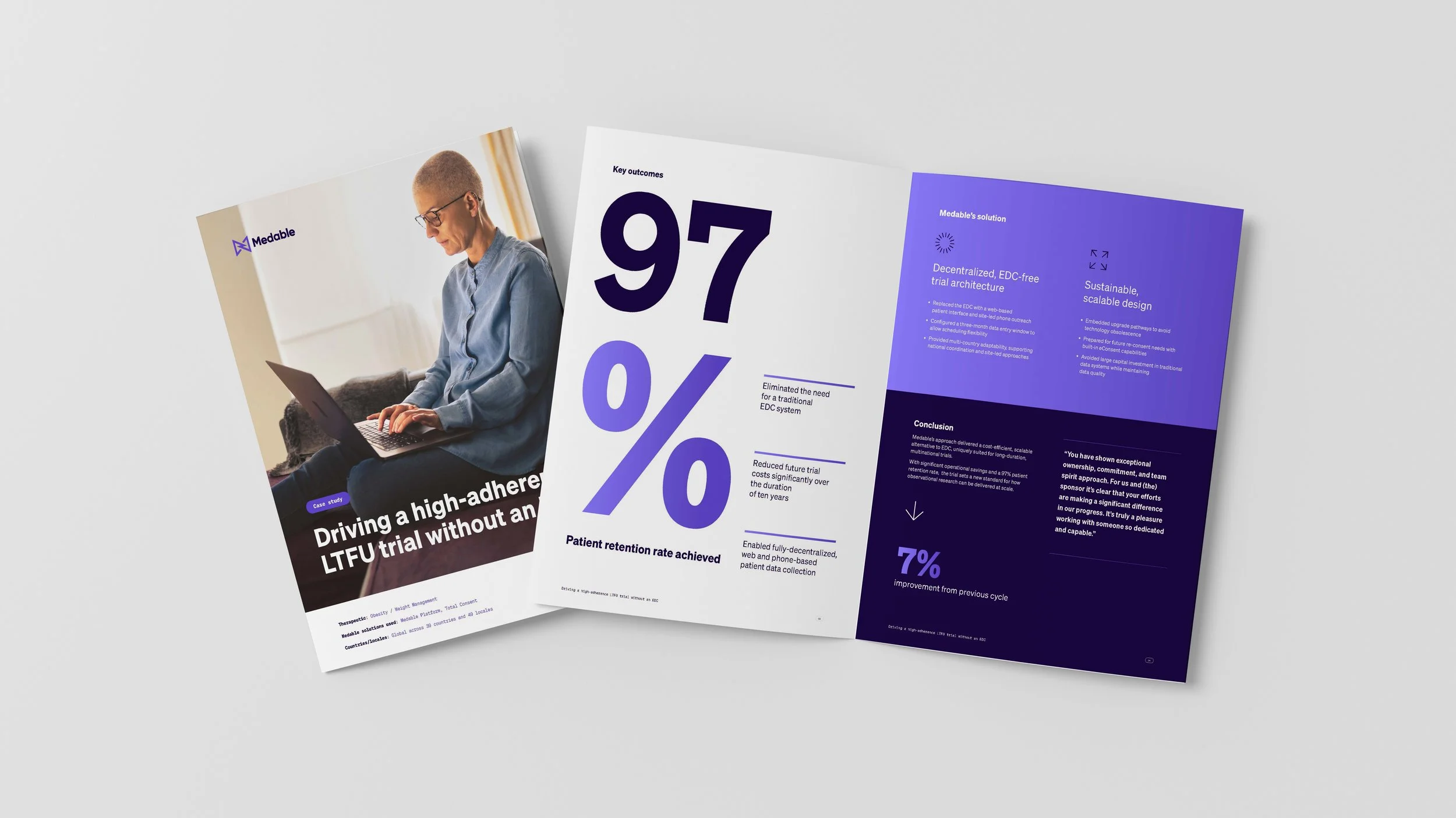
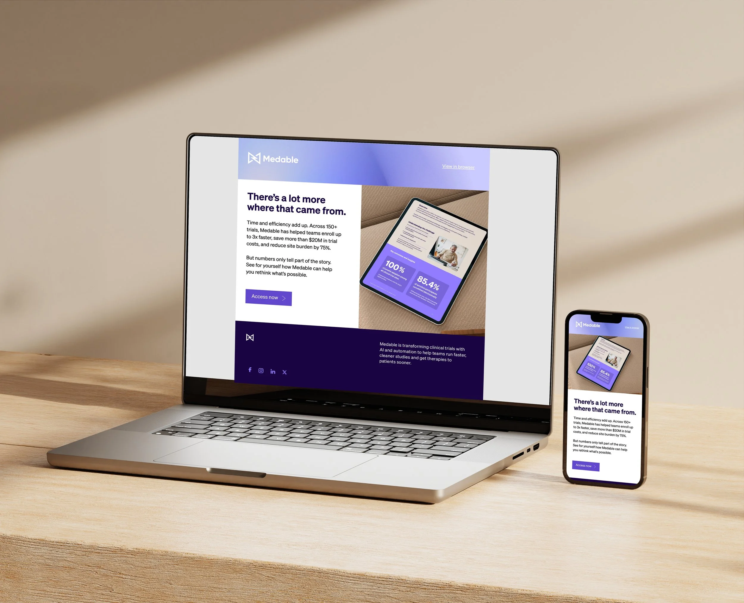
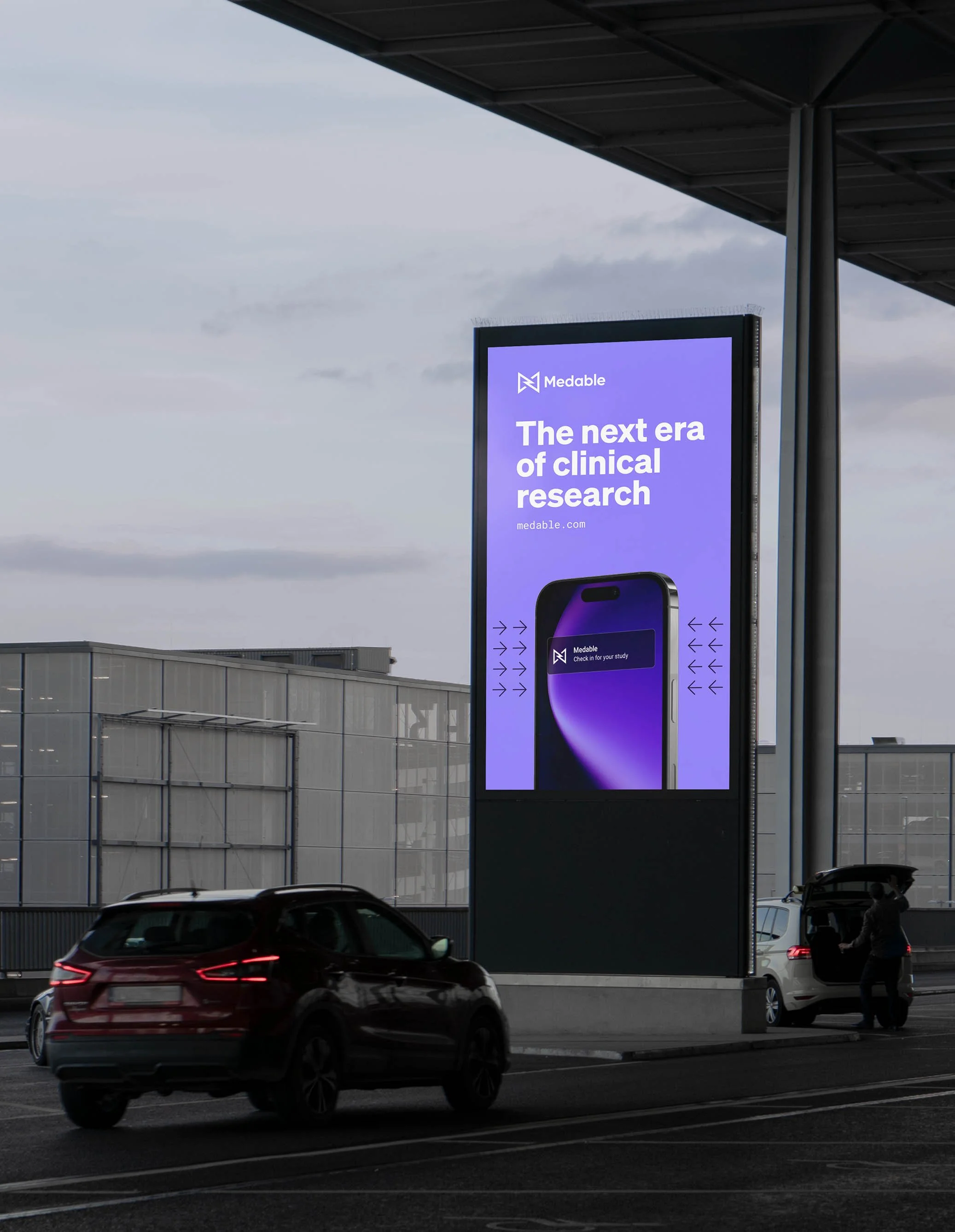
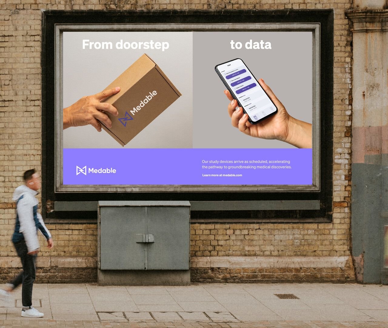
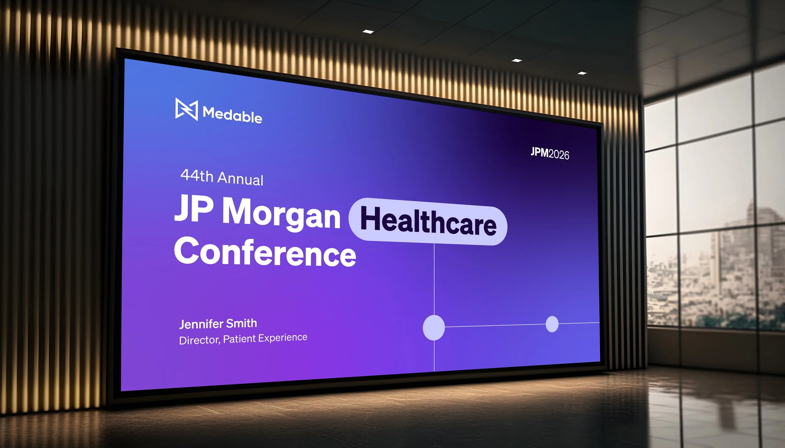
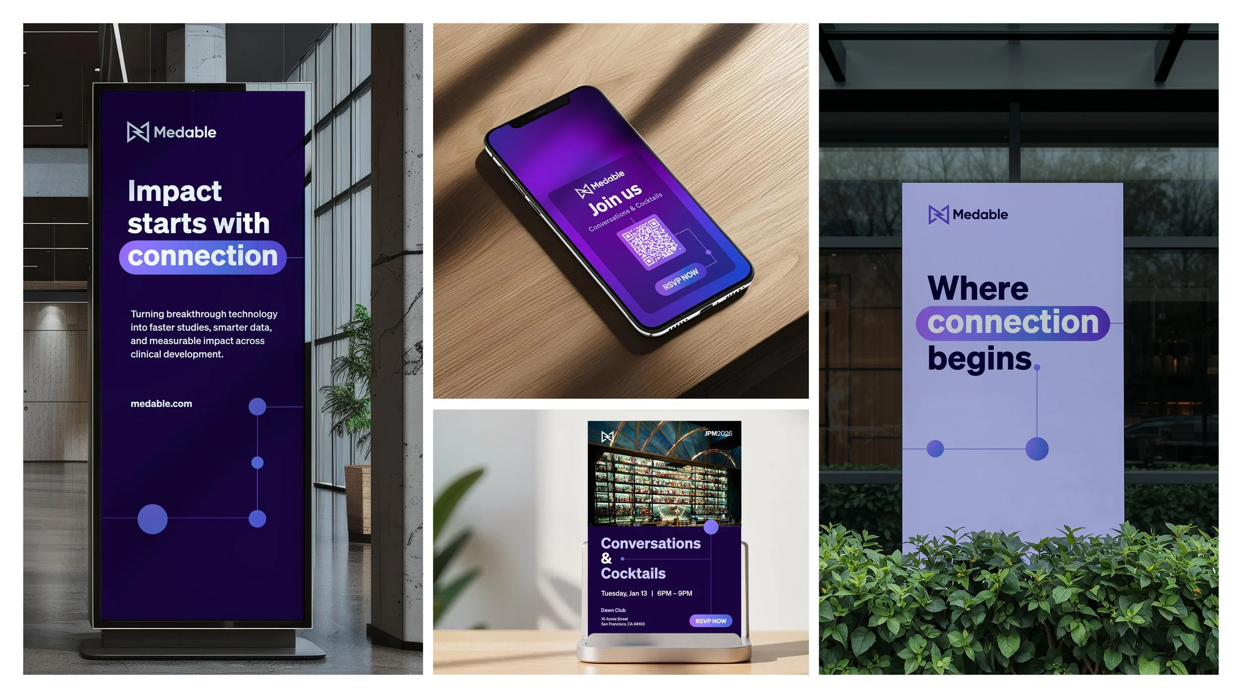
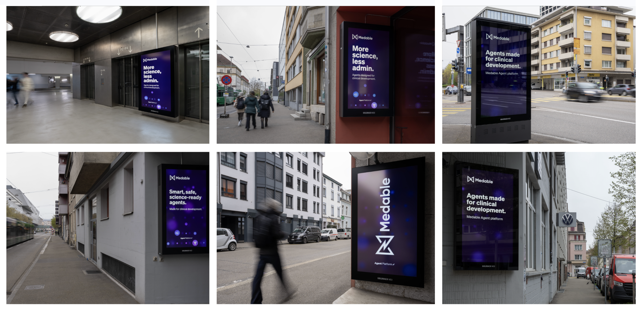
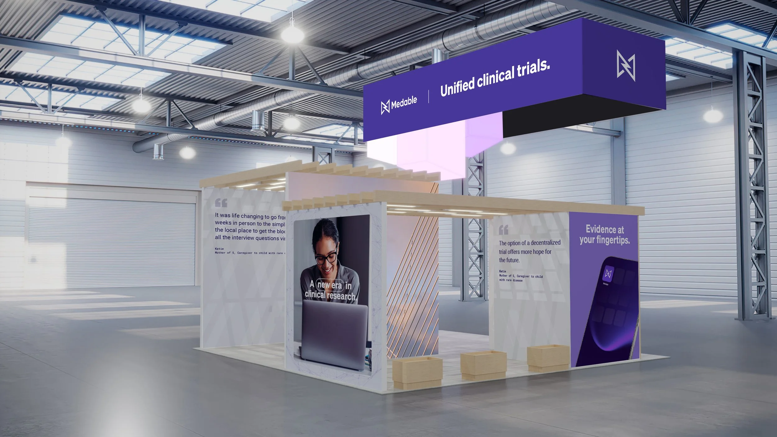
I translate complex clinical and data-driven narratives into clear, compelling visual systems that move seamlessly from white papers and LinkedIn campaigns to large-scale OOH, event environments, and booth experiences.
I work closely with cross-functional stakeholders to align on objectives, articulate design rationale, and ensure every decision strengthens the brand while remaining grounded in established guidelines.
Through strategic use of typography, color, hierarchy, motion, and spatial design, each asset contributes to a cohesive story—one that advances Medable’s visual language, amplifies its brand voice, and delivers consistent impact wherever the brand shows up.